In today’s crowded digital landscape, building a memorable brand is no longer optional—it’s essential. Every day, users are exposed to hundreds of brands, but only a few leave a lasting impression. What separates those brands from the rest is consistency.
A strong and consistent brand doesn’t happen by accident. It’s built through a well-structured system that ensures every visual and message aligns perfectly across platforms—from social media and websites to ads and print materials. This is where a brand kit becomes indispensable.
A brand kit acts as the foundation of your brand identity. It keeps your design, messaging, and communication aligned, helping your audience recognize and trust your brand instantly. When your branding is consistent, it not only improves recognition but also strengthens credibility and drives better engagement.
What Is a Brand Kit?
A brand kit is a centralized collection of all the elements that define how your brand looks, feels, and communicates with the world. It serves as a go-to resource for maintaining consistency across every touchpoint.
At its core, a brand kit bridges the gap between your brand identity and how it is expressed in real-world marketing and communication. Instead of scattered assets and inconsistent visuals, everything is organized in one place for easy access and use.
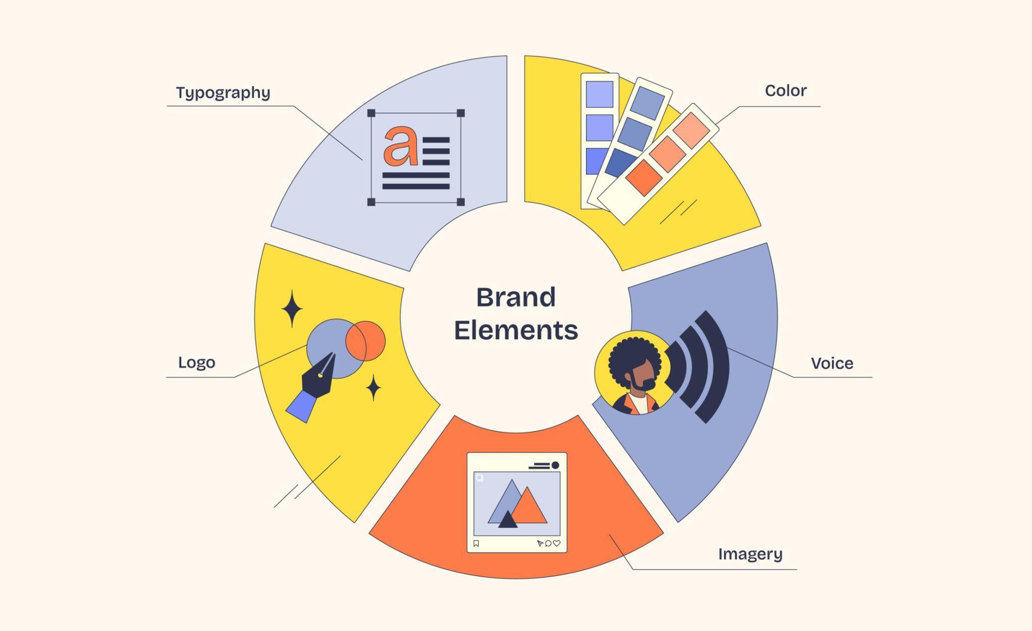
Key elements typically included in a brand kit:
- Logo variations (primary, secondary, icon versions)
- Color palette (with HEX, RGB, CMYK codes)
- Typography and font guidelines
- Imagery and graphic styles
- Brand voice and tone guidelines
- Templates for marketing materials
A well-crafted brand kit ensures that anyone—whether it’s your internal team, a designer, or a freelancer—can create content that stays true to your brand.
More importantly, a brand kit is not just a static document. It’s a dynamic system that helps businesses maintain a cohesive identity, improve efficiency, and scale their branding efforts without losing consistency.
Brand Kit Examples for Inspiration
To truly understand how powerful a brand kit can be, it helps to look at real-world examples. The following companies have built some of the most effective and recognizable brand kits—each demonstrating how consistency, creativity, and strategy come together to create a strong brand identity.
1. Google

Google’s brand kit is one of the most influential in the digital world. At the core of its branding is the Material Design system, which ensures consistency across all its products—from Search to Android apps.
Google’s brand kit goes beyond basic visual elements. It provides a scalable design framework, including color systems, UI components, iconography, and layout principles. This allows developers, designers, and partners to maintain a unified experience across devices and platforms.
Another defining aspect is its strict usage rules. Google clearly outlines how its logos, product names, and icons can be used—and what should be avoided. This ensures that even external partners maintain brand integrity.
Key takeaway:
Build a brand kit that is not just visual—but also functional and scalable across platforms.
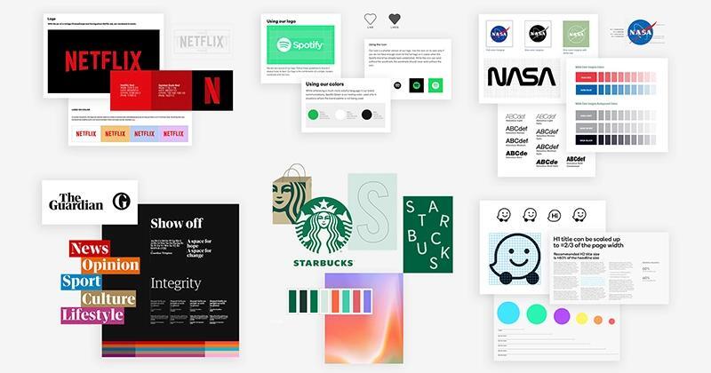
2. Spotify

Spotify’s brand kit is a perfect example of a dynamic and flexible identity system. Instead of rigid rules, Spotify uses a vibrant design language that evolves while staying recognizable.
The brand is widely known for:
- Its signature green color palette
- Bold, modern typography
- Unique duotone image treatment
This approach allows Spotify to maintain consistency while adapting to different campaigns and platforms.
Additionally, Spotify provides clear instructions for logo usage, minimum sizes, and placement rules—ensuring consistency even in creative executions.
Key takeaway:
A brand kit can be flexible and expressive—without sacrificing consistency.
3. Netflix

Netflix takes a minimalist yet powerful approach to its brand kit. Its identity revolves around a few highly recognizable elements:
- The bold red color
- The iconic “N” symbol
- Clean, cinematic visuals
The brand kit focuses heavily on logo usage rules, including spacing, contrast, and placement. This ensures the logo remains impactful across all mediums.
Netflix also integrates emotional storytelling into its branding, encouraging the use of imagery that reflects its entertainment-focused identity.
Key takeaway:
You don’t need many elements—just a few strong ones used consistently.
4. Airbnb

Airbnb’s brand kit is built around storytelling and emotional connection. At the center is the “Bélo” symbol, representing belonging, people, and community.
The brand kit includes:
- A diverse color palette
- Clean typography
- Strong emphasis on authentic photography
Airbnb’s guidelines go beyond visuals—they communicate a brand mission: “Belong Anywhere.” Every design choice supports this narrative.
It also provides detailed instructions on how to use logos across different contexts and backgrounds.
Key takeaway:
Your brand kit should reflect your brand story—not just your visuals.
5. Slack

Slack’s brand kit balances professionalism with personality. Its identity is built around:
- A multi-colored “octothorpe” logo
- A vibrant color system
- Clean, readable typography
Slack’s guidelines are divided into sections like brand identity, design elements, and governance—making them easy to follow and implement.
One standout feature is its tone of voice guidance, which emphasizes being human, conversational, and approachable.
Key takeaway:
A brand kit should define not just how you look—but how you sound.
6. Hulu

Hulu’s brand kit is a comprehensive and highly detailed system, spanning over 100 pages in its guidelines.
It includes:
- Signature green and black color scheme
- Detailed typography rules
- Logo variations and usage guidelines
- Campaign-specific branding adaptations
The brand kit also includes sections on tone of voice and marketing campaigns, allowing Hulu to stay consistent while adapting to different themes.
Key takeaway:
A detailed brand kit helps maintain consistency across large-scale campaigns.
7. Yelp

Yelp’s brand kit, known as the “Cookbook,” is a creative and practical guide to its brand identity.
It includes:
- Color and typography guidelines
- UI components like buttons and rating systems
- Design “recipes” for building branded elements
The focus is on usability and clarity, ensuring that every design element improves the user experience.
Key takeaway:
Make your brand kit actionable—not just descriptive.
8. Shopify

Shopify’s brand kit reflects its role as a global eCommerce platform. It focuses on:
- Clean, modern typography
- A recognizable green color palette
- Scalable design for merchants and partners
Its brand system ensures consistency across:
- Websites
- Apps
- Merchant stores
- Marketing materials
Shopify’s branding is designed to be flexible yet consistent, supporting millions of businesses worldwide.
Key takeaway:
Your brand kit should scale with your ecosystem and users.
9. Mailchimp

Mailchimp’s brand kit stands out for its playful and distinctive personality.
Key elements include:
- Bold yellow color palette
- Unique illustration style
- Friendly and conversational tone
Mailchimp uses branding to create an emotional connection, making marketing tools feel approachable and fun.
Its brand kit also provides clear rules for combining illustrations, typography, and messaging—ensuring consistency without limiting creativity.
Key takeaway:
A strong personality can make your brand more memorable and relatable.
These brand kit examples show that there’s no single “perfect” approach. Some brands focus on minimalism, others on flexibility or storytelling—but all of them share one thing: consistency backed by clear guidelines.
Step-by-step Guide to Creating a Brand Kit
Building a brand kit is not just about collecting logos and colors—it’s about creating a complete system that defines how your brand communicates visually and verbally. A well-structured process ensures your brand remains consistent, scalable, and recognizable across all platforms.
Below is a detailed, step-by-step guide to help you create a powerful and effective brand kit from scratch.
1. Create a Brand Strategy

Before you design anything, you must define the core foundation of your brand. Your brand strategy acts as the blueprint that guides every visual and messaging decision.
Start by answering these key questions:
- What is your mission and vision?
- What values does your brand stand for?
- Who is your target audience?
- What problem are you solving?
- How do you want people to feel about your brand?
You should also define your brand positioning—what makes you different from competitors. This includes your unique value proposition and market niche.
Another critical part is your brand voice and tone. Decide whether your brand is formal, friendly, playful, authoritative, or minimal. This will influence everything from website copy to social media captions.
👉 Pro tip: Document everything clearly. A strong strategy ensures your brand kit doesn’t become just a design file—but a strategic tool.
2. Design Your Visual Identity

Once your strategy is defined, it’s time to translate it into visual elements. Your visual identity is what people see first—and remember most.
Key components to design include:
Logo System
Create multiple versions of your logo:
- Primary logo
- Secondary logo
- Icon or favicon
- Monochrome variations
Ensure your logo works across different backgrounds and sizes.
Color Palette
Define a structured color system:
- Primary colors (main brand colors)
- Secondary/supporting colors
- Neutral tones
Always include HEX, RGB, and CMYK values for consistency across digital and print.
Typography
Choose fonts that reflect your brand personality:
- Heading font
- Body font
- Optional accent font
Set clear rules for font sizes, spacing, and hierarchy.
Imagery & Graphics
Define your visual style:
- Photography direction (realistic, minimal, lifestyle, etc.)
- Illustration style
- Iconography
👉 Pro tip: Consistency matters more than complexity. A simple, well-used identity is more powerful than a complex, inconsistent one.
3. Create a Brand Style Guide

A brand style guide is where everything comes together into clear, usable rules. This document ensures that anyone working with your brand follows the same standards.
Your style guide should include:
Logo Usage Guidelines
- Clear space rules
- Minimum size
- Incorrect usage examples (distortion, wrong colors, etc.)
Color Usage Rules
- When to use primary vs secondary colors
- Background combinations
- Accessibility considerations
Typography Rules
- Font hierarchy (H1, H2, body text)
- Line spacing and alignment
- Web vs print usage
Voice and Tone
- Writing style guidelines
- Do’s and don’ts
- Example phrases
Layout and Design Principles
- Grid systems
- Spacing rules
- Alignment
👉 Pro tip: Make your guide practical. Include real examples so users can apply the rules easily.
4. Develop Your Company’s Brand Assets

Now that your rules are defined, it’s time to create ready-to-use brand assets. These assets help your team apply branding quickly and consistently.
Common brand assets include:
- Social media templates (posts, stories, covers)
- Presentation slides (PowerPoint/Google Slides)
- Business cards and letterheads
- Email signatures
- Website UI components
- Ad creatives and banners
You may also include:
- Icon sets
- Illustration packs
- Image libraries
Organize everything into a centralized asset library, so team members can easily access and use them.
👉 Pro tip: Provide editable files (like Figma, PSD, or Canva templates) to make collaboration easier.
5. Compile Everything into a Shareable Brand Book

A brand book (or brand kit file) is the final compiled version of your brand system. It should be easy to access, understand, and share.
You can format it as:
- A PDF document
- A web-based guideline page
- A design system in tools like Figma
Your brand book should include:
- Brand strategy overview
- Visual identity elements
- Style guide rules
- Brand assets and templates
Make sure it’s:
- Well-organized
- Visually clean
- Easy to navigate
👉 Pro tip: Use visuals, examples, and real applications instead of just text-heavy explanations.
6. Monitor and Review

A brand kit is not a one-time project—it’s a living system that evolves with your business.
You should regularly:
- Review how your brand is being used
- Audit marketing materials for consistency
- Update guidelines when needed
- Adapt to new platforms and trends
Collect feedback from:
- Designers
- Marketers
- Customers
Also track performance metrics such as:
- Brand recognition
- Engagement rates
- Conversion rates
This helps you understand whether your branding is effective—or needs improvement.
👉 Pro tip: Schedule periodic updates (e.g., every 6–12 months) to keep your brand relevant and competitive.
Creating a brand kit is a structured journey—from strategy to execution and continuous improvement. When done right, it becomes one of the most valuable assets for your business.
It ensures that every piece of content, design, and communication reflects your brand consistently—building trust, recognition, and long-term success.
Read More: Small Business Collaboration: Beyond Email & Slack