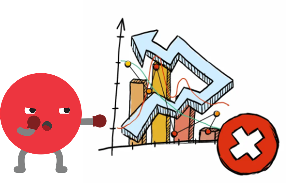
In 2026, data is everywhere. Organizations of all sizes collect mountains of information every day — from sales numbers and customer behavior to product performance, sensor data, and market trends. But raw data alone isn’t helpful. To make smart decisions, teams must explore and understand data clearly and quickly. That’s where AI data visualization comes in.
AI data visualization combines artificial intelligence with visual graphics — like charts, graphs, dashboards, and interactive visuals — to turn complex information into clear, actionable insights. Unlike traditional tools that require manual setup and technical know-how, AI-powered tools use machine learning, natural language understanding, and automation to extract patterns, suggest visuals, and explain what data means without deep technical skills. This makes data visualization not just faster, but smarter and more useful for teams across business functions.
In today’s fast-paced business environments, teams need visual insights instantly. They need answers to questions like “Where did revenue drop last quarter?” or “Which product category is trending upward this month?” without building endless spreadsheets or dashboards from scratch. With AI, you can ask these questions in plain language and get not only visuals but explanations and recommendations.
As companies handle larger datasets, the limitations of traditional BI (business intelligence) tools become clear: they often require manual chart building, technical expertise, and hours of configuration. AI is changing that. It automates repetitive tasks, discovers insights that humans might miss, and makes data exploration intuitive and accessible for technical and non-technical users alike. In a world where speed and accuracy matter, AI data visualization is transforming how teams work with data every day.
What Is AI Data Visualization?
At its core, AI data visualization is the use of artificial intelligence to enhance or automate the creation, interpretation, and presentation of visual data insights. It goes beyond static charts and dashboards by using algorithms that understand, interpret, and communicate complex datasets in ways that are meaningful to humans.
Traditional data visualization tools require analysts to prepare data, select the right chart type, arrange visuals, and interpret results manually. In contrast, AI tools can often analyze raw data automatically, determine which patterns are significant, choose the most effective visual formats, and even generate plain-language summaries of insights. This can include:
Automatic Chart Selection: AI analyzes the nature of data and selects relevant visualizations — like line charts for trends, heat maps for density patterns, or scatter plots for correlation analysis — without needing someone to choose manually.
Natural Language Interfaces: Users can interact with data using conversational queries like “What were our top-selling products this quarter?” and receive graphical answers instantly.
Predictive and Prescriptive Visuals: Modern AI systems don’t just show what has happened; they use predictive models to forecast future outcomes or explore decision scenarios through “what if” graphs and models.
Interactive Dashboards: Instead of static visuals, AI enables dynamic dashboards that update in real time, adapt to new data streams, and personalize views based on user roles or behavior.
Many AI visualization platforms also embed advanced machine learning models that can detect anomalies, highlight outliers, or generate recommendations based on hidden patterns in the data. These capabilities reduce reliance on expert analysts, bring insights closer to business users, and foster a data-driven culture where decisions are based on evidence, not intuition.
AI data visualization is about unlocking deeper insights faster and making complex data understandable for every team member — from analysts and managers to executives and frontline staff.
Why AI Data Visualization Matters for Teams

AI data visualization isn’t just a trend — it’s a practical necessity for modern teams. Here are the key reasons it matters:
1. Faster Decision-Making
When teams can see insights instantly, decisions happen faster. Instead of waiting hours or days for analysts to prepare reports, AI tools generate visuals on demand, updating automatically as data changes. This real-time capability is critical in high-velocity environments like marketing campaigns, financial markets, supply chain monitoring, and customer support operations.
2. Greater Data Accessibility for Everyone
Traditional BI tools often require technical skills like SQL querying or familiarity with dashboard builders. AI visualization tools break down these barriers by allowing users to interact with data using plain language and guided analytics. This democratizes data access, empowering non-technical roles — such as sales, HR, or operations — to explore insights without specialized training.
3. Deeper Insights and Pattern Discovery
AI doesn’t just visualize data — it analyzes it. Machine learning algorithms can uncover trends, correlations, and anomalies that might be missed with manual exploration. These can be surfaced directly in visuals, prioritized based on importance, and explained in natural language to help teams see what matters most.
4. Personalized Visual Experience
Different roles need different insights. AI can tailor visualizations to user preferences or job functions, presenting CFOs with financial trend dashboards while showing marketers engagement metrics. Personalized dashboards ensure relevance without rebuilding views for every audience.
5. Scalable Insight Generation
Teams are dealing with ever-larger datasets. AI scales with data size, handling millions of rows and multiple data sources without manual configuration. It generates insights consistently across datasets, reducing human error and fatigue.
6. Support for Predictive and Future-Focused Strategy
Today’s leaders need to predict where outcomes are heading — not just report on history. AI visualization integrates predictive modeling to show future trends, simulate outcomes, and help teams prepare action plans. This elevates visualization from reporting to strategic planning.
Together, these advantages make AI data visualization indispensable for teams that want to move faster, think smarter, and collaborate better with data.
Key Features to Look for in AI Data Visualization Tools

When evaluating AI data visualization tools in 2026, some features stand out as essential — not nice-to-have. These core capabilities ensure that the tool goes beyond basic charting and delivers real business value:
1. Natural Language Query and Interaction
The ability to ask questions in plain language and receive visuals instantly is a hallmark of AI visualization. This uses natural language processing (NLP) so users aren’t forced to learn query languages or manual filtering.
2. Automated Insight Generation
Look for tools that don’t just create visuals, but also surface insights automatically — such as anomalies, trends, correlations, and important deviations — and explain why they matter. This saves teams from digging manually through spreadsheets.
3. Intelligent Chart Recommendation
AI should analyze data structure and choose the most effective visual format for clear communication. Tools that recommend the best chart types help users avoid misrepresentation or confusion.
4. Real-Time and Streaming Data Support
Modern dashboards need to reflect live data. Tools with real-time processing and dynamic updating empower teams to act on fresh information without lag, critical for operations that change by the minute.
5. Predictive and What-If Analytics
A predictive component lets teams visualize future scenarios, forecast outcomes, and simulate strategic decisions. This shifts visualization from hindsight reporting to foresight planning.
6. Collaboration and Sharing Features
Insights matter most when shared. Tools that enable easy sharing, commenting, and collaborative exploration help align teams and foster data-driven decisions across departments.
7. Scalability and Integration
AI visualization tools should integrate with multiple data sources — including databases, cloud storage, CRM systems, and APIs — and scale as data grows. This ensures long-term usability and flexibility.
8. Explainable AI and Transparency
Users need to trust the visual insights they receive. Features that explain how recommendations were generated — rather than black-box outputs — help teams validate results and maintain confidence in AI decisions.
In combination, these features distinguish powerful, future-ready AI visualization platforms from basic BI tools. They ensure that teams can not only see their data but understand it, act on it quickly, and make smarter decisions.
Best AI Data Visualization Tools for Teams
In 2026, AI data visualization tools have become central to how teams explore, analyze, and communicate insights from data. The most powerful platforms now combine natural language understanding, automated dashboard generation, predictive analytics, and collaboration workflows to make data more accessible to everyone — not just analysts. Below, we explore three standout tools that teams across industries are using in 2026.
1. ClickUp
ClickUp has expanded beyond project and task management into the world of data insights and visualization. Its AI-augmented dashboards help teams connect data from different systems and generate visuals without complex setup.
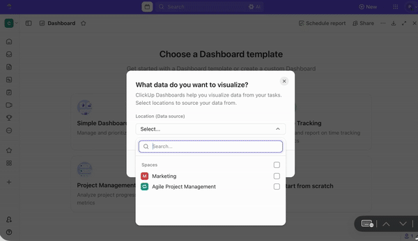
AI-Driven Reporting & Visualization
ClickUp’s AI can transform raw data into charts and dashboards automatically, based on the questions you ask or the business goals you set. Instead of building visuals from scratch, users describe what they want (e.g., “show monthly sales growth by region”) and ClickUp’s AI suggests and builds relevant visualizations right away.
Collaboration and Productivity Integration
Because ClickUp is already used for project planning and workflows, its visualization features link seamlessly with tasks and team calendars. This means teams can set alerts, assign action items directly from charts, and embed dashboards into project spaces — much like having an active analytical hub where insights and action live together.
Ease of Use
Non-technical teammates appreciate how the system hides technical complexity. Instead of SQL or manual configuration, users interact with AI prompts or guided forms that populate visuals instantly. This lowers the barrier to entry for marketers, product managers, customer success teams, and executives alike.
Team-First Features
Interactive dashboards that update as data changes.
Embedded summaries and highlight reels powered by AI.
Shared workspaces with permissions and comment threads for discussing insights in context.
Overall, ClickUp helps teams centralize planning and insights without forcing employees to leave familiar tools.
2. Julius AI
Julius AI is built around the idea of making data conversations as natural as chatting with a colleague. It blends NLP (natural language processing) with real analytics capabilities so you can simply talk to your data.
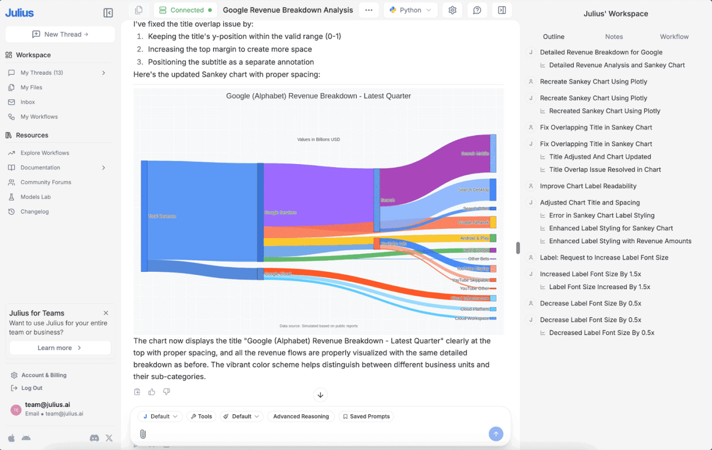
Conversational Data Exploration
At its core, Julius AI lets users type questions in everyday language and receive visual answers instantly — no dashboards, filters, or technical stacks required. For example, asking “What were our busiest sales days in the last quarter?” generates charts, trend lines, and even narrative summaries automatically.
Smart Data Preparation
One common pain point with dashboards is cleaning and transforming raw datasets before visualization. Julius AI’s built-in preprocessing features help automate this with prompts like “group by product category and fill missing price data.” This automation brings novice users closer to professional-level analytics without needing Excel or manual staging.
Scenario Planning and Forecasting
Teams don’t just want to look at the past — they want to forecast the future. Julius AI supports quick scenario modeling, letting teams ask hypothetical questions like “If we increase marketing spend by 20%, how might conversions change?” and see visual trend simulations in response.
Workspaces for Teams
Julius AI includes collaborative dashboards where teammates can co-edit visuals, share findings, tag each other, and assign tasks based on insights.
Strengths:
Instant visual generation from questions.
Friendly for non-analysts.
Collaborative team features.
Limitations:
Because Julius is still a newer entrant compared to established BI tools, users sometimes find customization and advanced modeling options less granular than legacy enterprise tools. Third-party review data shows varying feedback around customization and maturity levels.
3. Zoho Analytics
Zoho Analytics is a mature business intelligence and analytics platform with powerful AI features that support teams of all sizes. Its AI assistant — “Zia” — helps users generate visuals, detect patterns, and interpret data narratives without manual intervention.
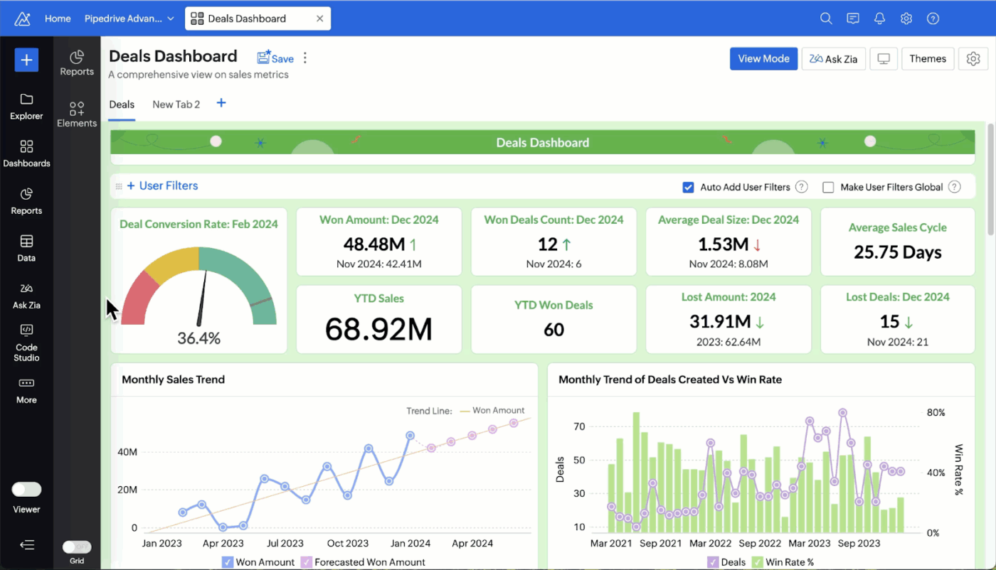
AI-Powered Natural Language Interaction
Users can ask Zia to create visualizations by simply talking or typing questions. For example, “Show me this quarter’s customer churn by segment” results in a complete chart with labels and context. Zia can also explain the numbers behind the graph, offering narrative takeaways, which is invaluable when presenting to stakeholders.
Broad Integration Ecosystem
Zoho Analytics connects with hundreds of data sources — including databases, cloud apps, files, and storage services — and keeps dashboards synchronized automatically. This simplifies the workflow, especially for teams pulling data from disparate systems.
Predictive Insights and Anomaly Detection
Zoho’s AI includes features for forecasting future trends and spotting anomalies (e.g., unusual spikes or dips in performance). Dashboards can surface alerts when key indicators drift outside expected ranges — critical for time-sensitive decisions.
Interactive and Dynamic Dashboards
Beyond static visuals, teams can explore dashboards interactively — filtering, drilling down into specific segments, or pivoting data views — with changes reflected live. Detailed sharing options make it easy to disseminate insights across departments with role-based access.
Robust Collaboration and Mobility
Teams can comment directly on dashboards, annotate visuals, and even embed slideshows for meetings. Mobile apps ensure insights are available on the go.
Ideal For:
Teams that require full analytics workflows from data prep to predictive visuals.
Businesses needing role-based access and secure sharing.
Users who want both AI automation and manual control over visual design.
What Can Go Wrong With AI Data Visualization (And How to Avoid It)
While AI data visualization unlocks powerful insights, it also introduces risks and pitfalls that teams must manage carefully. Without understanding these challenges, teams can make poor decisions or lose trust in their analytics. Below are common pitfalls — along with ways to avoid them.
1. “Cleaned” Data That’s Quietly Wrong
AI tools often automatically clean and prepare data before visualization. This is usually helpful — but sometimes the AI makes decisions that obscure real issues:
Filling missing values incorrectly
Assuming default aggregations that don’t match business logic
Merging datasets based on ambiguous keys
When this happens, visuals look tidy but don’t reflect the true story.
Why It Happens:
AI models try to infer the best transformation based on patterns, but they don’t always understand context. For example, treating missing customer ages as zeros instead of unknown can distort averages.
How to Avoid It:
Implement data validation checkpoints before visualization.
Review automated transformations manually, especially for critical reports.
Document your data sources and transformations clearly.
Strong data governance and cleansing processes ensure that AI isn’t masking underlying issues.
2. Confident Insights That Imply Causation
AI models are excellent at detecting correlations and patterns — but correlation is not causation. An AI tool might generate a visualization that shows a relationship between two variables and present it with high confidence. Teams might mistakenly read this as a causal link.
Example:
A chart might show that ice cream sales and sunglasses purchases rise together, which could be misinterpreted as ice cream drives sunglasses sales instead of both rising due to summer weather.
Why It Happens:
AI systems optimized for pattern detection don’t inherently understand real-world context or causal mechanisms.
How to Avoid It:
Treat AI-revealed correlations as hypotheses — not conclusions.
Pair AI visuals with domain expertise to interpret causality.
Use controlled experimentation or statistical methods when causal answers are required.
Always consider business logic and real-world context alongside AI outputs.
3. Permission and Privacy Gaps
AI tools often connect to multiple data sources and compile data across departments. When team members can visualize data freely, privacy and access controls become critical.
Potential Problems:
Unauthorized access to sensitive information.
Data leaks via shared dashboards.
Visuals exposing personally identifiable information (PII).
How to Avoid It:
Implement clear role-based access controls.
Mask or anonymize sensitive attributes before they are loaded into visualization tools.
Audit dashboard sharing permissions regularly.
Security policies should be part of your data governance strategy, especially when dashboards are accessible outside analytics teams.
4. “Real-Time” That Isn’t Actually Real-Time
Many AI visualization platforms advertise “real-time” dashboards. However, not all tools refresh instantly — some update on schedules (e.g., every 15 minutes or hourly), which might not meet critical operational needs.
Why It Happens:
True real-time requires continuous data streaming and processing, meaning heavier infrastructure and cost. Scheduled refreshes can give the appearance of real-time while lagging behind live events.
How to Avoid It:
Confirm actual refresh rates for dashboards with real-time claims.
For mission-critical alerts (e.g., fraud detection, customer churn surges), use tools with true streaming capabilities or direct database connections.
If timely action matters, make sure the tool’s refresh architecture meets your operational needs.
5. Dashboard Sprawl
As teams build more dashboards, it’s easy to end up with a cluttered landscape of visuals — many of which nobody uses.
Dashboard sprawl leads to:
Confusion over which dashboard is the truth
Redundant or conflicting views
Burden on IT or analytics teams to maintain dozens of reports
How to Avoid It:
Define dashboard governance standards for creation and retirement.
Consolidate similar dashboards and prune ones with low engagement.
Assign dashboard owners responsible for updates and accuracy.
Focus dashboards on clear business questions rather than creating visual artifacts for every conceivable metric.
How to Use AI for Data Visualization in Your Workflow

AI data visualization is not just about generating better charts. It is about redesigning how your team interacts with data every day. In 2026, the most effective teams embed AI into their daily workflows so insights appear automatically, decisions move faster, and reporting no longer slows progress.
Here’s how to apply AI visualization strategically inside your workflow.
1. Use AI to Create Multiple Dashboards Instantly
One of the biggest advantages of AI-powered tools is speed. Instead of manually designing every chart, selecting fields, configuring filters, and formatting visuals, AI can generate multiple dashboards in seconds.
In practice, this works through:
Natural language prompts (e.g., “Create a marketing performance dashboard for Q1”)
Automated data scanning that identifies key metrics
Smart grouping and aggregation
Recommended visual types based on data structure
For example, a sales team might need dashboards for:
Regional revenue performance
Individual rep productivity
Pipeline health
Customer churn
Instead of building four separate dashboards manually, AI can scan the dataset and produce them automatically with sensible chart selections, trend lines, and summaries.
This approach improves workflows in three key ways:
Faster Reporting Cycles
Weekly and monthly reports no longer require hours of setup. Teams can regenerate dashboards as new data arrives.
Role-Based Customization
Executives may need high-level KPI summaries, while operations teams need detailed breakdowns. AI tools can tailor dashboards to different roles instantly.
Experimentation Without Friction
Teams can quickly test different views of data. For example, you can ask for revenue grouped by geography, then by product, then by time period — without rebuilding charts from scratch.
The key to making this work effectively is to define:
Clear naming conventions
Standard KPIs
Consistent data sources
When the foundation is structured, AI can multiply output without multiplying confusion.
2. Automate Your Data Visualization Workflow
AI becomes truly powerful when it removes repetitive steps from your analytics process. Instead of treating visualization as a one-off task, leading teams automate the entire pipeline from raw data to insight delivery.
A modern AI visualization workflow typically includes:
Automatic Data Syncing
AI tools connect to multiple data sources such as CRM systems, finance tools, spreadsheets, databases, and APIs. Instead of manually importing data, dashboards update automatically when new data is added.
This ensures:
No outdated reports
No version confusion
No manual data exports
Smart Data Preparation
Data cleaning is often the most time-consuming part of analytics. AI tools now assist by:
Detecting missing values
Suggesting transformations
Standardizing formats
Flagging anomalies
However, automation should always include human oversight. Automated cleaning must be reviewed to avoid subtle distortions in metrics.
Automated Insight Highlighting
Rather than expecting users to scan dashboards visually, AI can:
Highlight unusual spikes or drops
Surface outliers
Detect statistically significant changes
Generate written summaries of trends
For example, instead of manually noticing that customer churn increased 8% in a segment, the system can automatically flag it and explain the potential drivers.
Scheduled Reporting and Alerts
AI tools can distribute dashboards automatically to stakeholders:
Weekly email summaries
Slack or Teams alerts
Threshold-based notifications
This ensures insights reach decision-makers without requiring manual follow-ups.
Embedded Collaboration
Modern AI visualization platforms integrate directly with project management and communication tools. Teams can comment on dashboards, assign follow-up actions, and track tasks tied to insights.
This transforms visualization from passive reporting into active workflow management.
To automate effectively:
Identify repetitive reporting tasks.
Standardize recurring KPIs.
Set threshold alerts for critical metrics.
Document ownership for each dashboard.
Automation saves time, but governance keeps it reliable.
3. Model Future Scenarios and Visualize Possible Trends
In 2026, AI visualization is not limited to showing what happened. It increasingly helps teams explore what might happen next.
Predictive modeling and scenario simulation are now built directly into many AI-powered tools. These features allow teams to:
Forecast revenue trends
Predict churn risk
Estimate campaign performance
Model resource allocation outcomes
Here is how it works in practice:
Trend Forecasting
AI models analyze historical patterns and generate forward-looking projections. These forecasts are displayed visually through trend lines, confidence intervals, and probability bands.
Instead of static quarterly reports, leadership teams can view:
Expected revenue growth ranges
Sales pipeline projections
Inventory demand forecasts
What-If Analysis
Teams can adjust variables and instantly see projected outcomes.
For example:
What if marketing spend increases by 15%?
What if prices rise by 5%?
What if a new product launches next quarter?
AI recalculates projections and visualizes possible impacts immediately.
Risk Visualization
AI can identify risk scenarios by detecting volatility, irregular patterns, or early warning signals in data. Dashboards may highlight segments that are trending toward churn or regions where performance is declining.
To use predictive visualization effectively:
Combine AI forecasts with domain expertise.
Treat projections as guidance, not certainty.
Regularly retrain models as new data arrives.
Monitor prediction accuracy over time.
The goal is not to replace strategic thinking but to enhance it with evidence-based foresight.
Frequently Asked Questions (FAQs)
1. Can non-technical team members use AI data visualization tools?
Yes — and that is one of their biggest strengths.
Modern AI visualization tools are built with accessibility in mind. Features like natural language querying, drag-and-drop interfaces, and automated chart generation reduce technical barriers.
Instead of writing SQL queries or configuring advanced filters, users can:
Ask questions in plain language
Select datasets from guided menus
Receive automatic summaries
However, ease of use does not remove the need for basic data literacy. Non-technical users should still understand:
The difference between averages and medians
How percentages are calculated
The risks of misinterpreting correlations
Organizations benefit when they pair AI tools with basic data education, ensuring teams interpret insights responsibly.
2. How Does AI Data Visualization Differ From Traditional Dashboards?
Traditional dashboards typically require:
Manual chart creation
Manual data preparation
Static layouts
Technical configuration
AI data visualization adds several intelligent layers:
Automated Insight Discovery
AI surfaces patterns automatically instead of waiting for users to find them.
Natural Language Interaction
Users can ask conversational questions rather than building queries manually.
Adaptive Recommendations
The system suggests chart types and filters based on data context.
Predictive Capabilities
AI dashboards can forecast future trends, not just report historical data.
Dynamic Updates
Dashboards adjust automatically when data changes, sometimes even highlighting meaningful differences.
Traditional dashboards display data. AI-powered dashboards interpret and enhance it.
3. Is AI-Generated Data Visualization Accurate Enough for Business Decisions?
AI-generated visualization can be highly accurate — but only when the underlying data and models are reliable.
Accuracy depends on:
Clean and validated data sources
Proper data governance
Transparent model logic
Human oversight
AI excels at pattern detection and trend analysis. However, it does not inherently understand business context. That means:
Correlations should not be mistaken for causation.
Forecasts should be evaluated against real-world factors.
Automated data transformations should be reviewed.
The most effective teams treat AI visualization as a decision-support tool — not an unquestioned authority.
When combined with:
Clear data ownership
Regular auditing
Cross-functional review
AI-generated dashboards can confidently support strategic and operational decisions.
Read More: Small Business Operating System: 7 Key Workflows